The anticipation is over, friends! We’re finally finishing off the house reveal with our principal bedroom and ensuite. We absolutely love how the entire house came together exactly the way we wanted and we’ve been so honoured to be able to share the journey with you! Even though we’ve been living in it for a few months now, getting to do the reveals online makes it feel brand new again!
Putting together the principal bedroom was a fun experience because it’s such a personal and intimate space that it really needs to reflect who the couple is and what they want their sleeping oasis to be. We kept to the overall feel of the house with the white, bright spaces and wood textures. The ensuite is a beautiful complimentary space that completes the whole look and feel of our principal bedroom. I’ll walk you through some of the details that we’re loving between the two new spaces.
PRINCIPAL BEDROOM
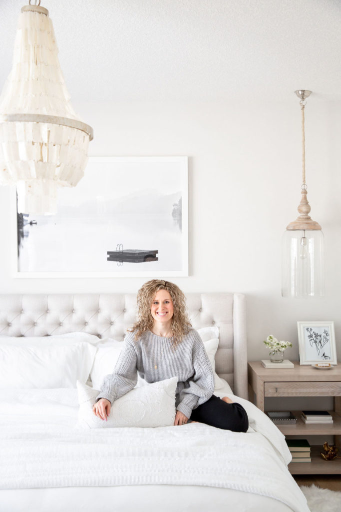
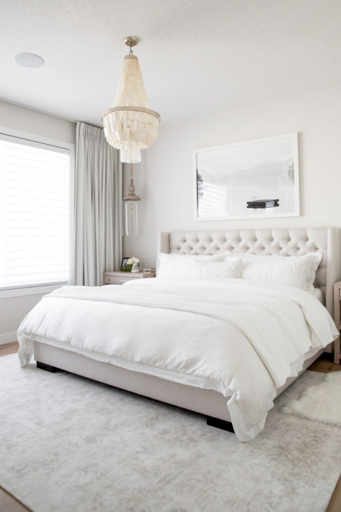
Gosh, darn it, I love this neutral palette! And my husband is getting use to it 😉 It’s far different from our previous bedroom which was bold and had color. My husband has now given up on asking when the color is coming in! But, truth be told, he’s starting to love the calmness this space brings!
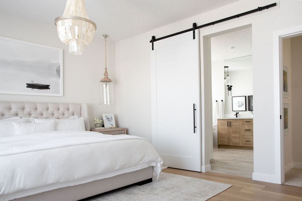
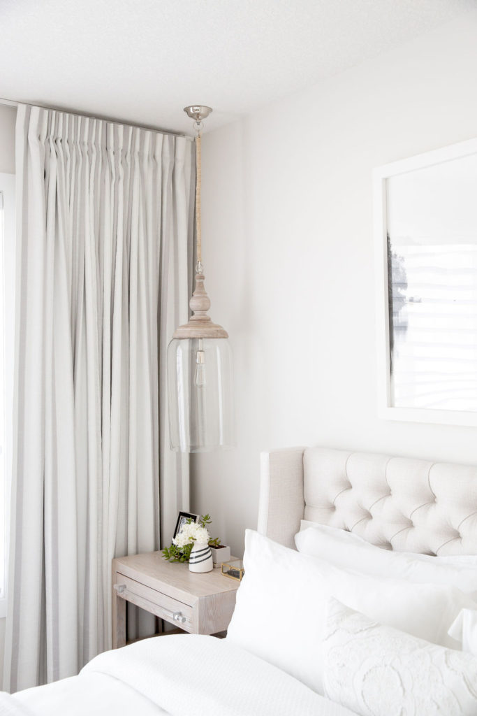
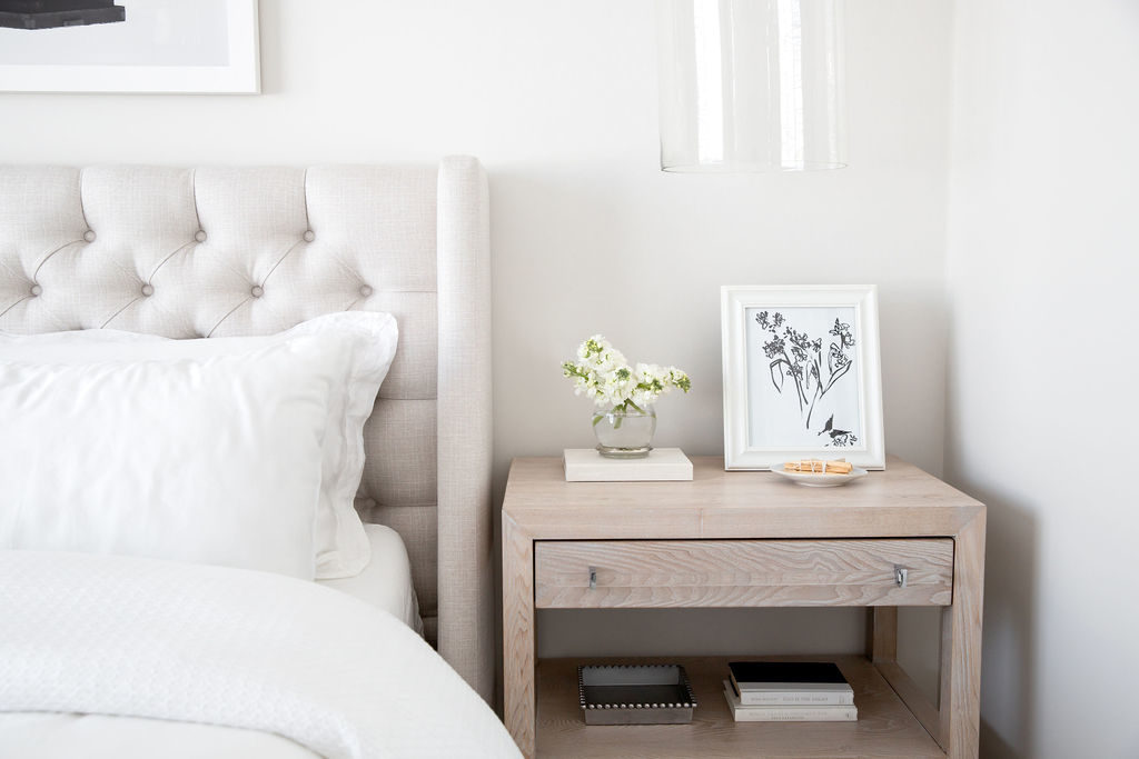
Weaving elements of soft greys, oatmeal tones and whites was the perfect balance this large space needed. I wanted to mix modern and rustic elements into this space and achieved this with the modern style nightstands with tempered glass handles paired with these oversized glass pendents on either side with a really unique rope detail! The custom upholstered bed with the tufted details softens the space perfectly!
You’ll see very minimal pattern in this space, a soft stripe pattern in the custom black out drapery and a tone on tone, soft damask pattern in the large area rug to help ground the space and add an element of cozy. And lastly, this large serene lake landscape piece of art for above the bed was the perfect touch to remind me of the family lake I grew up on! Talk about a little slice of heaven and the perfect sanctuary for us!
PRINCIPAL BATH
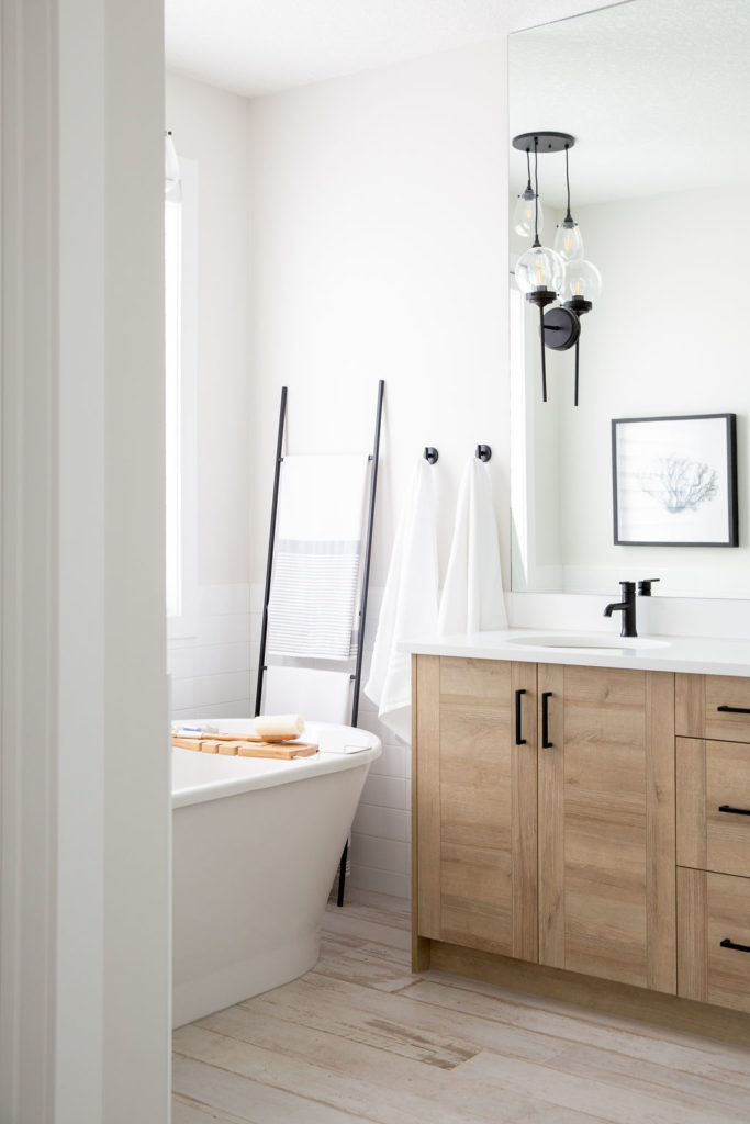
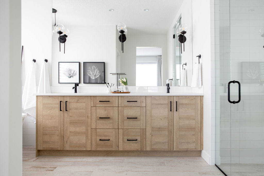
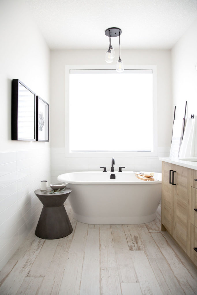
Carrying onto our En suite which flows through a large barn door from our bedroom, this space also has elements of the Modern Farmhouse feel! We decided to use black accents throughout the bedroom and bathroom hardware to create a very classic look. The floor tile which emulates a hardwood look was the perfect balance of adding in texture but with a rustic flare! And the best part, it doesn’t show a thing – BONUS!
The custom vanity with the two sinks provides ample storage and is visually appealing as you enter the space! Fresh white walls, large white subway tile that is accented throughout the bath & shower area creates a modern touch for the perfect balance! Lastly, one of our favorite parts of this space is the floor-level shower – I love how it’s continuous and makes it feel like it’s all part of the same space and extra bonus, you never have the opportunity to stub a toe while entering the shower! It’s the little things, truly.
