
We don’t always get to work with wallpaper, but when we do, there’s always a story behind it! It hasn’t earned the best reputation (*cue a flashback to your Great Aunt’s living room*), so we’re all the more grateful that our wonderful clients trust us to do it justice. With thoughtful selection and application, wallpaper adds dimension, texture and intrigue—a magical combination.
Let’s take a stroll through some of our favourite wallpapers to-date, plus a few we’re dreaming of!
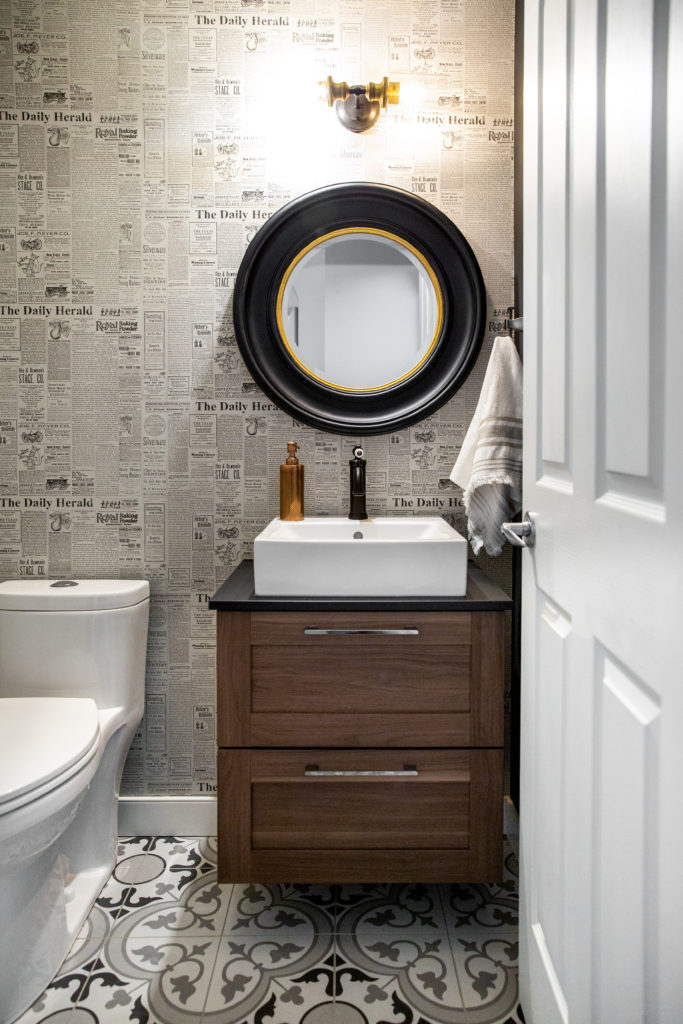
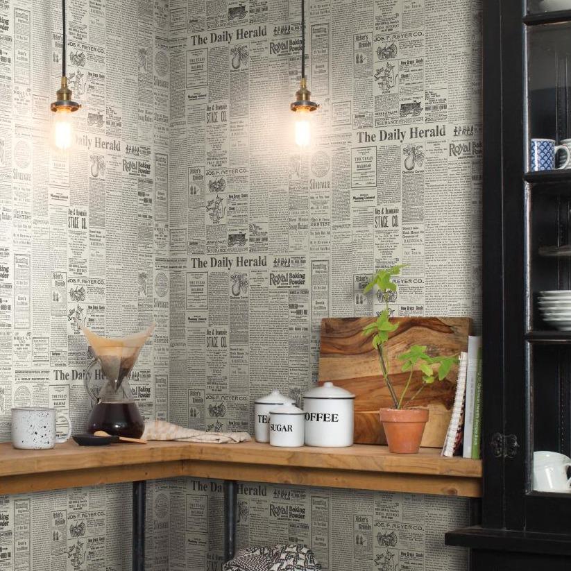
Vintage Newspaper
Isn’t this powder room darling? It’s a little modern and a little rustic, with plenty of fuss-free details. We reimagined and replaced everything, making this one a total overhaul. When it came time to select wallpaper, this newspaper pattern offered a soft, vintage-inspired feeling to balance the bold tiles and matte black accents. It features historical copies of The Daily Herald (from the 1930s, to be specific), designed by none other than Joanna Gaines!
Bold Plaid Pinstripes
From the get-go, we knew this bedroom makeover called for a little drama. The pattern makes a sleek, sophisticated nod to plaid—the kind you’d see on a designer dress shirt. No lumberjacks here! Notice how it gives off a slight optical illusion? We knew it would be a nudge out of our client’s comfort zone, and much to our excitement, he gave it a big thumbs up! A memorable feature for the room, and a memorable moment for us.
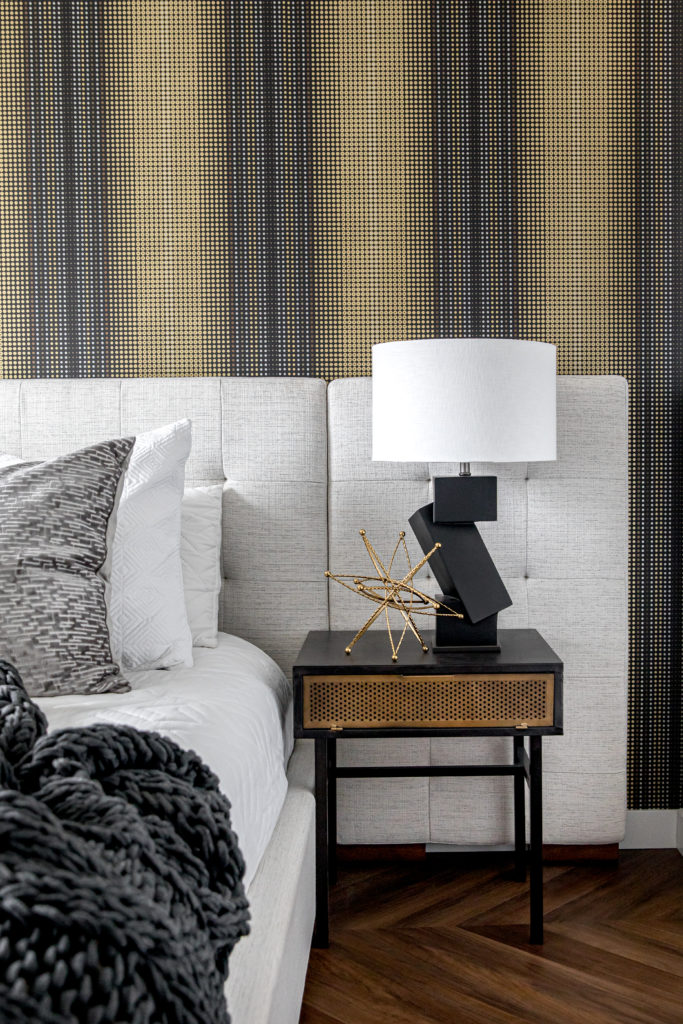
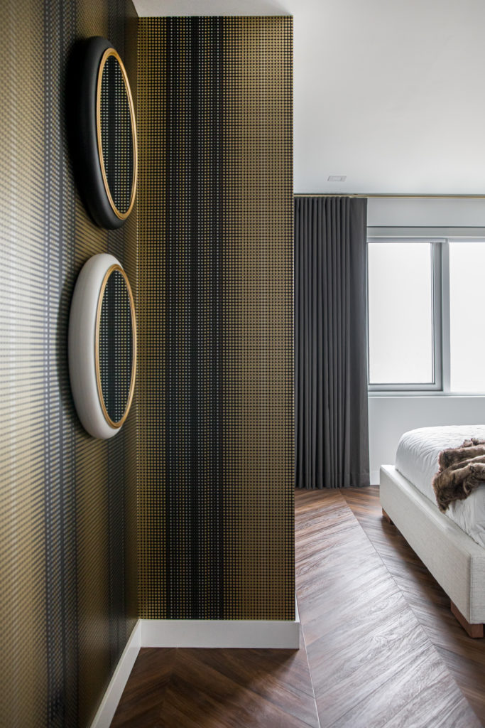
View the full project reveal of this Condo Principal Bedroom HERE!
Rolling Layers
Hallways can easily become an afterthought, so we made sure this hallway got the same level of sophisticated edge as its adjoining bedroom. Peaks and valleys? Flowing waves? It’s up for interpretation, but that might be our favourite part of this pattern. It’s organic, fluid and draws your eye right in! A bold statement like this mirror can feel heavy in a narrow hallway, but this neutral wallpaper balanced it beautifully.
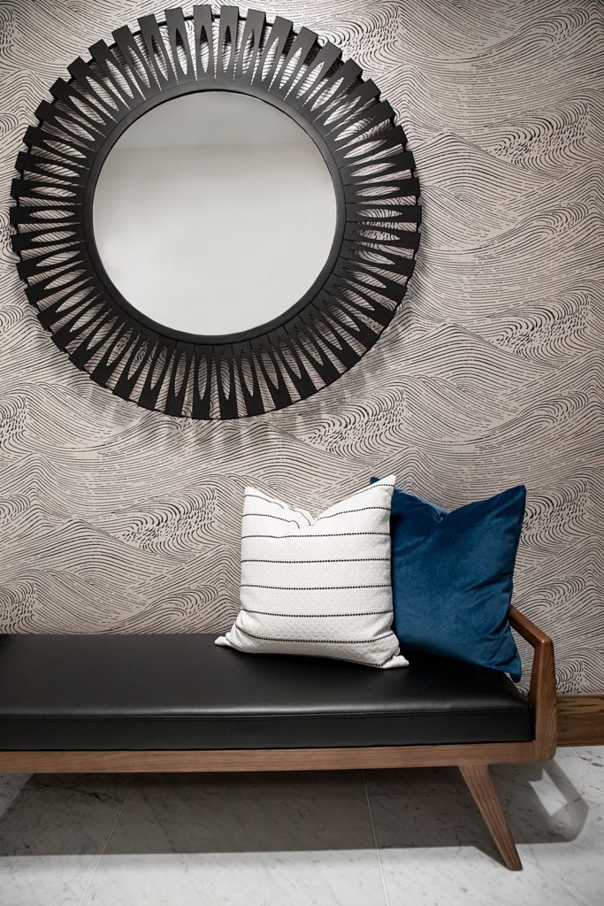
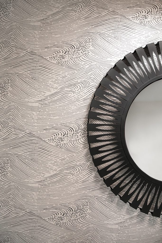
View the project reveal where we used this wallpaper HERE
Minimalist Hand Script
This dreamy wallpaper is in our very own Katie Rioux’s powder room. A neutral loyalist with a love for clean contrast, Katie was after a pattern that popped with character but didn’t overwhelm. Her final pick totally hit the mark! It’s romantic and elegant, yet simple and minimalist with just a little quirk—the best of all worlds. Fun fact: The cursive script is all for looks, truly! After plenty of guesses, we confirmed it doesn’t say real words at all!
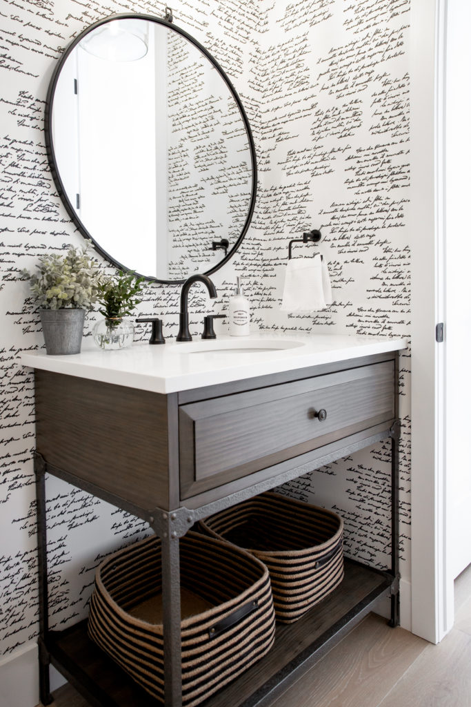
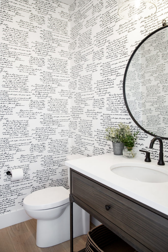
View Katie’s Full Home Tour HERE!
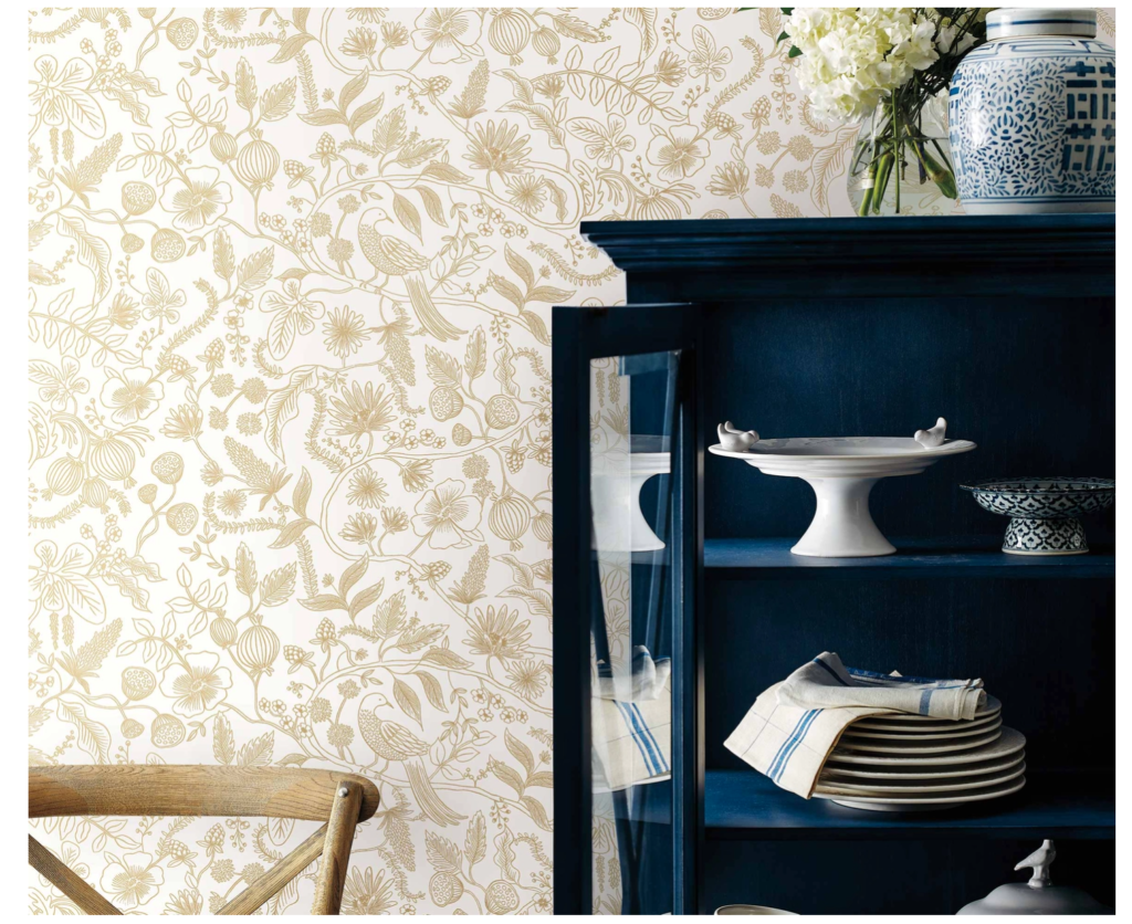
Winding Blooms & Birds
We haven’t had the chance to bring this gorgeous floral print to a project quite yet, but we’re such big fans, we’re including it as a future favourite! We’ll consider planting the project seed with this. If you look a little closer, you’ll see gorgeous branches, birds and poppy pods among the blooms, and the detailed linework is printed in gorgeous metallic. It feels ethereal and whimsical, but warm and approachable. What’s not to love?
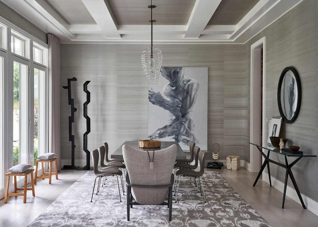
Muted Texture
Sometimes, subtly is everything. This space is a monochromatic dream! In our opinion, the muted, industrial-feeling wallpaper brings it all together with understated intrigue for an overall feeling of editorial edge. When a room leans all-neutral, there’s a true opportunity to add dimension with texture and accentuating pops. Between this wallpaper and the artful black accents, we have to say, they nailed it! BRB, we’ll be staring at these photos forever.
We’re pretty sure these walls would tell us they’re happy to be living in style. Remember: When it’s done right, wallpaper is your friend, and the selection process is pretty darn fun when we’re in it together! Let’s talk about bringing your design dreams to life.
Inspired? You might also like…
Take Note: Your summer textile edit: Easy swaps to embrace the season
Sanctuary: Katie’s Home Reveal

